Monday, February 8, 2016

Mario Bros.

Name: Mario Bros.
Year: 1986
Publisher: Nintendo
Developer: Nintendo
Genre: Arcade, Platformer (Single Screen)
Hours Played: Countless
Beaten: N/A
High Score: 77,710
After Donkey Kong (1981) but before Super Mario Bros. (1985) came the arcade game Mario Bros.  Although it was a one-screen platformer, in the vein of it's predecessor, it would introduce many of the elements that would become Mario staples, including sewer pipes, malevolent turtles, momentum when you run, falling from any height, and of course Mario's green-clad brother Luigi.

Every level has the same layout, and features Mario (and in two-player co-op mode, Luigi) running around platforms, attempting to hit enemies from beneath to stun them and then touch them head-on to knock them out of commission.  Like many older arcade games, the challenge comes from keeping track of everything on screen at once; stunned enemies get up and move faster if ignored for too long, fireballs appear unexpectedly at the edge of the screen, and sentient icicles can freeze platform sections.  For true chaos, add in a second player; bumping into them can send both of you ricocheting into enemies (a mechanic later revisited in the New Super Mario Bros. games).

Unlike so many of the games in it's vault, Nintendo has figured out exactly where this game belongs: as a free mini-game. You can play a slightly updated version as a battle game in Super Mario Bros. 3, play it in full from the SMB3 title screen in Super Mario Bros. All-Stars, and it's included in numerous Game Boy Advance Titles (Super Mario Advance 1-4, Mario & Luigi).  Interestingly, all of these use the NES version of the game, as opposed to the technically superior arcade version, suggesting that Nintendo considers this the "real" version of the game (or at least the easiest to port).

Mario Bros., along with Balloon Fight, was one of the first competitive co-op games, and still holds up when played with two players.  That being said, it's short length made it difficult to justify a $50 price tag even back in 1986, and with the release of Super Mario Bros. 3 in 1990, this cartridge became all but obsolete.

Graphics & Animation: 3 (Average)
The graphics here are pretty good;  Mario, the green sewer pipes, and the Koopas (known back then as "Shellcreepers") are instantly recognizable.  For such  a short game, though, I wish they could have included the extra animations from the arcade game (Mario burning when he touches a fireball, turles stepping outside their shells and flipping them over, etc).

Music & Sounds: 1 (Bad)
No in-game music (except little ditties when the game starts), and the sound effects, while effective, are sparse.  Not much to say because there's not much here.

Controls & Level Design: 4 (Good)
The controls in Super Mario Bros. are top-notch, and it's easy to see why: Nintendo was perfecting them all the way back with this game.  Although there's no "run" button, momentum (jumping higher when running, sliding when you turn quickly) still plays a huge part in this game, forcing you to be aware of enemies' positions at all times lest you leap headfirst into one...

Story & Presentation: 1 (Bad)
Not much to say here.  The title screen looks pretty good (better then most of the black box arcade games, actually), and there's a nice little melting effect when the icicles freeze the platforms... and that's about it.

Length & Replayabilitiy: 1 (Bad)
Multiplayer is the only reason to keep coming back to this game, but even then, you're going to get tired of Mario Bros. pretty quickly.

Total: 9 (Average)

Friday, February 5, 2016

Q*Bert

Name: Q*Bert
Year: 1989
Publisher: Ultra Software
Developer: Gottlieb
Genre: Arcade, Isometric Platformer
Hours Played: Countless
Beaten: N/A
When arcade games began stealing quarters away from pinball machines in the seventies, it was only natural that pinball companies would start producing their own video games.  One such company, Gottlieb, produced dozens of popular pinball machines, but only ever managed one successful video game.  But oh, what a one-hit wonder it was.

The concept for Q*Bert began when doodles by artist Jeff Lee, involving Kustom Kulture-inspired characters moving around an M. C. Escher-inspired landscape, were discovered by programmer Warren Davis, who wanted to practice implementing gravity and physics in a video game.  The resulting prototype was discovered by executives at Gottlieb, and the results became the world's first isometric perspective video game.

Like most one-screen arcade games, the premise of Q*Bert is simple.  You hop around a pyramid built of cubes while avoiding enemies.  Every spot you land on turns that cube a different color, and when you've landed on every cube, you progress to the next level.  Teleportation disks on the sides of the pyramid serve the same purpose as the warp tunnels in Pac-Man, allowing for quick escapes from enemies.  Besides bouncing eggs and snakes, Q*Bert must also avoid enemies who walk on the "wrong" sides of the cubes (defying gravity), and catch green creatures who will undo the tiles you've turned.

Nowadays, Q*Bert is mostly known for his appearances in movies such as Wreck-It Ralph and Pixels, and this is largely because his rights are currently owned by Sony, but in his heyday the popularity of Q*Bert rivaled that of Pac-Man.  Their were toys, board games, and even a cartoon show.  While the game isn't fondly remembered as Donkey Kong or DK JR, the gameplay has held up better, still presenting an enjoyable romp today.  There's definitely better games on the NES, and the simple gameplay hardly justifies a $50 price tag, but if you've never experienced Q*Bert, it's definitely worth a moment of your time.

Graphics & Animation: 2 (Average)
While it's hardly the worst looking port of Q*Bert, the graphics of Q*Bert aren't anything to write home about.  Still, everything from the arcade is at least recognizable...

Music & Sounds: 0 (Awful)
If you're going to port a game with no music, you can at least make sure you've got the sound effects right! Maybe Q*Bert's signature "cussing" sound effect was just too hard to mimic, I dunno; but seeing as how there's plenty of NES games with digitized speech, and we're only talking about one (famous) sound effect, it seems a little lousy of them to leave it out.

Controls & Level Design: 3 (Good)
The level design in Q*Bert is simple, but classic, and as more levels progress, changing the color of the tiles becomes more complicated.  The control scheme can take a little getting used to, but they added a comprehensive set-up screen for changing the controls to your liking.

Story & Presentation: 3 (Good)
The presentation here is actually fairly impressive!  Most notable is the game's controller setup screen, which features an NES controller and a Q*Bert player to guide you through the process of configuring your controls.

Length & Replayabilitiy: 1 (Bad)
The latter levels giving you new goals gives the game a little longevity, but the truth is, Q*Bert is one of those games where you've seen everything the game has to offer after five minutes.

Total: 9 (Average)
Wednesday, February 3, 2016

Battle Chess

Name: Battle Chess
Year: 1990
Publisher: Data East
Developer: Beam Software
Genre: Board Game
Hours Played:
Beaten: No, I suck at chess
Battle Chess was a novelty game for computers and consoles in the late eighties/early nineties.  The concept is simple: it's just standard chess, but when you move, the pieces get up and walk around, and when you capture another piece, you get to watch the two characters fight each other.  The game is loaded with over 100 animations, as every possible paring of pieces has it's own unique battle animations, and the charm of the game comes from the different character's personalities: knights creak and lumber around the board, rooks transform into rock monsters, etc.

Although it's not widley remembered now, Battle Chess was very popular (espicially for PC) and spawned a number of sequels and spinoffs; however, unlike contemperary cult classics like Archon, there doesn't seem to be any indication of a Battle Chess remake or revival or Kickstarter (EDIT: turns out I was wrong).  That's because unfortunately, like all novelties, the novelty of Battle Chess eventually wears off.  The appeal of the game is to show off your hardware to your friends, and see how many different kill animations you can discover; once you've done that, you're left with a pretty standard chess simulation.  If you just want to play chess on your NES, you're better off sticking with Chess Master: it has a teaching mode for beginners and better AI for experts.  But if you want your friends to think you're smart while watching medieval characters kill each other, there's always Battle Chess.

Graphics & Animation: 4 (Excellent)
The animation is the showcase here, and the NES does a pretty good job of mimicking it's PC brethren.  There's over a hundred different battle animations (one for every possible combination of attacker/defender), and each piece has it's own distinct personality.

Music & Sounds: 2 (Average)
This is one case where I don't mind the lack of music during the main game, as true chess players would probably find it a little distracting.  The grunts and groans of the combatants are a nice touch, though.

Controls & Level Design: 1 (Bad)
The game controls just fine (although I wish it had a cancel button), and I can't really fault chess for a lack of level design.  My main complain here is the lack of options; compared to Chess Master, this is a pretty bare-bones representation.

Story & Presentation: 4 (Excellent)
This cartridge may have more cutscenes then any other single NES game, thanks to all the unique battles between the pieces.  The game has a style all of it's own - it's actually pretty violent for an NES game.

Length & Replayabilitiy: 1 (Bad)
Trying to find every combination of pieces will keep you entertained for a little while... but after that, you'd better really like chess.

Total: 12 (Average)

Monday, February 1, 2016

Millipede

Name: Millipede
Year: 1988
Publisher: HAL Laboratory
Developer: Atari
Genre: Arcade
Hours Played: 2
Beaten: N/A
Centipede was a wildly successful arcade game released in 1980.  A single-screen shooter in the vain of Space Invaders or Galaga, Centipede broke new ground (no pun intended) by having the game take place in a garden instead of space, and filling the screen with harmless, stationary objects (mushrooms) that obstruct your shots at the enemy (spiders, fleas, and the titular centipede).  The object is to destroy the centipede as he travels down the screen, and shooting him causes him to split into smaller centipedes.

The game was successful enough to see a sequel, Millipede, in 1982.  Besides introducing a couple new elements (DDT bombs, new enemy behaviors), the game was mostly the same, and never enjoyed the popularity of it's predecessor.  While Centipede was ported to all the consoles and computer systems of it's day, Millipede only managed a handful of ports.

And yet, it was Millipede and not Centipede that Atari chose to port to the NES in 1988.  Prehaps they figured that sinse their wasn't that much difference between the games, it only made since to pick the "superior" version.  Whatever the reason, the NES port of Milipede is a little... lacking.

The biggest problem here is the playing field.  Millipede for NES only uses about two thirds of the screen, leaving the rest as a green border.  It's truly baffling; the NES is capable of fairly accurate graphics for Pac-Man, Galaga, and Joust, but apparently the bugs and mushrooms of Millipede were just too much for it?  The game feels like a port of a computer version, rather then a direct arcade port.

And... that's it.  Honestly, I've run out of things to say about this game.  It's an awful-looking port of a moderately playable arcade game, and I can think of literally hundreds of NES games I would buy over this one.

Graphics & Animation: 0 (Awful)
Millipede was never exactly the most graphically impressive game, but it was at least colorful and appealing; this is just abysmal.  I usually try not to compare NES game to games for other systems. but com'on - Centipede for the Atari 7800 looked better then this, and this is a sequel game on a more powerful console!

Music & Sounds: 1 (Bad)
The arcade sound effects are pretty accurately recreated here.  Unfortunately, the game has no music, not even when you start or end a level.

Controls & Level Design: 3 (Average)
The controls are a little slippery, and the levels just repeat endlessly, but that's all in keeping with it's arcade heritage, so I can't fault it too much there.  Unlike the original Centipede, Millipede adds a grayed out effect to the bottom of the screen to make it clearer where your ship's boundaries are - a useful (if not as visually appealing) touch.

Story & Presentation: 0 (Awful)
HAL game this game a scaled down presentation, similar to the title screens of Donkey Kong and Balloon Fight on the NES - and this was three years later. I hate to keep repeating this, but... Centipede on the Atari 7800 looked better then this!!

Length & Replayabilitiy: 0 (Awful)
I complain about arcade games like Joust and Pac-Man for being just one level that repeats over and over and over, but at least those were good quality ports.  This is abysmal.

Total: 4 (Bad)

Friday, January 29, 2016

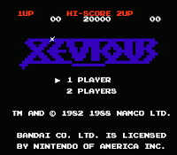
Xevious

Name: Xevious: The Avenger
Year: 1988
Publisher: Bandi
Developer: Namco
Genre: Shoot'em Up
Hours Played: Countless
Beaten: N/A
(Note: the official NES title of this game is "Xevious: The Avenger", but it's just a port of the original Xevious.  This kind of embellishment was a common practice for NES ports of arcade games.  It's especially odd in this case, since "Xevious" is the name of the planet, not the main character.)

Xevious is a vertical scrolling game originally released in 1982.  While it might not seem impressive at first glance, it's hard to explain just how influential it was at the time.  Although it wasn't the first vertical shooter, it was the first one to become well known, and it holds up surprisingly well.

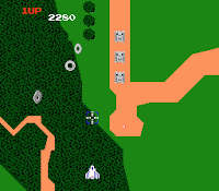
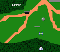
The basic concept of Xevious is pretty easy to understand. You fly over a lush alien planet covered in forests, landing strips, and water, and try to destroy the enemy's vehicles and bases without getting destroyed yourself.  You start with the only two weapons in the game, a standard gun, and a bomb.  The gun is for airborn targets and the bomb works on land targets.  Both kind can fire back at you, and many airborne craft with attempt to ram you, as well.  Every so many levels there is a giant mothership (considered one of gaming's first bosses), which fires a barrage of bullets but can be destroyed with a single well-placed bomb.

While it all sounds simple enough, Xevious is a surprisingly difficult - and complex - game.  While most shooters of this type (Legendary Wings, 1942, etc) can be mastered with enough practice and memorization, Xevious has just enough elements of randomness to ensure that the enemy placement is never exactly the same on any two playthrus.  The result is, unlike most NES action games such as Mega Man, you'll never be able to get by simply learning the enemy patterns and reacting accordingly.  What's worse is that Xevious isn't scared to play dirty.  While enemy patterns seem fairly standard in the first few levels, as you progress, the game will throw at you everything from screen-sized multi-blasts, to heat-seeking bullets that chase you around, to enemies that fly up from the bottom of the screen (a serious violation of vertical scrolling conventions!).

Like most arcade games of it's ilk, Xevious continues indefinitely, but instead of simply repeating the same levels (a la Pac-Man), the game remixes and multiplies the enemy placement.  You know how after you beat Super Mario Bros, you get to play the game again, only all the Goombas are replaced with Buzy Beetles?  Imagine that, only instead of a congratulations screen, the game just cycles back to world 4, and for every Goomba there's now three Buzy Beetles and a Latuika.  Once you've progressed far enough, the game becomes the world's first bullet hell - I tried playing with save states, and literally reached a point I couldn't get past even while cheating.  That's my definition of a tough game.

All in all, Xevious is a well-crafted game that was ahead of it's time.  Every time you play it, it throws something new at you.  While it's considered a seminal shooter in Japan, it's never quite gained the same notoriety in America, and that's a shame; as far as endless shooters go, it doesn't get any better then this.

Graphics & Animation: 3 (Good)
Xevious does a whole lot with very little.  Using only a handful of colors and designs, the game is able to produce some pretty intricate landscapes for you to fly over - a refreshing change of pace from the endless starfields of most shmups.

Music & Sounds: 1 (Bad)
The good? The main theme does a nice job of evoking suspense.  The bad?  There's only two songs i the entire game - the main theme, and the tune that plays when you start a new life.  The music's iconic, but it gets old fast.

Controls & Level Design: 3 (Good)
The controls are very tight in this game, and the Solvalou (your ship) always goes where you want it to.  The dual-layered level design (air and ground targets, requiring two different weapons) still feels clever even thirty years later.

Story & Presentation: 1 (Bad)
There's a cool little effect in this game where, instead of announcing when you've made it to a new level, you instead fly over a large expanse of forest.  It's a cool little way of subtly letting the player know you're in new territory.  Other then that, there's not a lot of presentation to be had here.

Length & Replayabilitiy: 4 (Excellent)
This is one of the first video games I ever owned, meaning I've been playing it for about as long as I can remember, and in writing this review, I still came across new tricks and enemy types I'd never seen before.

Total: 12 (Average)

Wednesday, January 27, 2016

Mega Man 4

Name: Mega Man 4
Year: 1991
Publisher: Capcom
Developer: Capcom
Genre: Platformer
Hours Played: Countless
Beaten: Yes, without cheats
Mega Man 4 is often regarded as one of the "bad" Mega Man games - generally placing just after 6 and 1 in terms of people's general dislike for it.  Yet it doesn't have the unforgiving difficulty of the first game, or the poor level design of the sixth game, or even the odd control quirks of the third.  So why the poor reputation?

The answer is because, for better or worse, Mega Man 4 marks the point that the series became paint by numbers.  After the careful fine tuning of 2 and the unique storytelling chops of 3, the rest of the series from here on out would follow a careful formula: an opening cut scene introduces a new villain, Mega Man beats all 8 robot masters, tackles the new villain's castle and beats him, Dr. Wiley is revealed to be behind it, Mega Man tackles an all new Skull Castle and beats Dr. Wily. Again. Rinse and repeat.

You may be tempted to give Mega Man 4 a pass for this - after all, it's the first game to use this formula, right? (Assuming you don't count Dr. Wily's "surprise" betrayal in 3) But even here, it feels like the developers were more interested in trying to remake Mega Man 2 then they were in innovating.  Once again we have a water-theme villain (which until this point was only seen in MM2), a villain who shoots fire (1 and 2), an earth-theme villain (okay to be fair I think they all have one of those)... heck, with Bright Man they literally reused Flash Man's weapon and didn't even bother renaming it.  The last stage of the game also seems extremely familiar to those who've beaten Mega Man 2, right down to entering a dark room for the final boss, and having the lights come on in a lab when the fight's over.

The most controversial addition, however, is the Mega Buster, Mega Man's new default weapon. By holding the fire button for a few seconds, Mega Man can release a larger, more powerful shot.  This addition appeared in all the subsequent Mega Man games, and even other series, such as Mega Man X. Many fans feel this made the game "too easy" or took the emphasis off acquiring the bosses' weapons.  Is this true?  Well, yes and no.  Your standard weapon IS more powerful, not because of the charge shot (which only does x3 the damage of a normal bullet) but because the game no longer restricts you to only shooting three shots at a time.  Why even bother with the charge shot when you can pump an endless barrage of bullets into your enemy?  As for using the boss weapons, the issue is that Capcom greatly reduced the amount of damage that Robot Masters take from the the weapon their "weak" to, meaning their's less point in figuring out the correct weapon to use.  The result of all this is the easiest levels but hardest robot masters (and hardest boss rush) in the series up to this point.

All that being said, I would by no means call Mega Man 4 a bad game.  The music, while not as memorable as 2 or 3, is still leaps and bounds over most music on the NES, and the graphics are actually better then ever.  Mega Man 4 boasts the best opening cutscene (the only time we see Mega Man's origin recounted), the best "weapon get" screen, and the most colorful minibosses of the entire series.  There's even a couple moments of innovation: hearkening back  to the original Mega Man, there's two "adapter" items (one is a grappling hook, the other is Item 1 from MM2), and they're hidden in the robot master stages; finding them actually takes a little creative thinking, which I really enjoyed.

Graphics & Animation: 4 (Excellent)
Capcom was clearly trying to outdo themselves in the graphics department, and they succeeded: the over-sized cartoony enemies from three are even bigger and cartoonier here, there's more giant mini-bosses then ever, and the cutscenes (including the "get weapon" scenes) are the best in the series.  You'd be hard pressed to find a better looking game on the NES.

Music & Sounds: 3 (Good)
There's not as many "get stuck in your head and stay there forever" songs in this game as their are in the previous entries, but there's still some good ones (even years later, I can hum you Skull Man's music), and once again the sheer amount of different tunes in a single NES cartridge is impressive all on it's own.

Controls & Level Design: 3 (Good)
The controls here are tight, and for the first time ever, Mega Man doesn't fall off ladders if you pause and unpause the game.  In older games, Mega Man couldn't have more then three bullets on the screen at once, due to technical limitations of the NES; here, they resolved that problem, but didn't tweak the difficulty to account for it, meaning you can spam the fire button in a way not possible before.  The levels are a little lackluster as well, relying too heavily on minibosses then before - Ring Man's level stands out as an especially egregious example, with four minibosses and only a handful of obstacles otherwise.

Story & Presentation: 4 (Excellent)
Regardless of what everyone else at Capcom were doing, the art department was clearly under the impression they were working on the greatest Mega Man game ever, because everything in the presentation and cutscenes shines here.  While the opening cutscenes in the next two games would focus on setting up plot and red herring villians, the intro here is all about Mega Man himself, and gives us the more characterization about him then the other five games combined.

Length & Replayabilitiy: 3 (Good)
Technically the longest Mega Man game to date, but definitely not as replayable as some of the others.  The hidden items do add a little replayability to the game, though.

Total: 17 (Good)

Monday, January 25, 2016

Yoshi's Cookie

Name: Yoshi's Cookie
Year: 1993
Publisher: Nintendo
Developer: Bullet-Proof Software
Genre: Abstract Puzzler
Hours Played: 2
Beaten: No
When Tetris first came to the States from Russia in 1984, there were a lot of legal battles over who owned the rights (in Russia, according to laws at the time, the game was owned by the government and not the creator).  After many lawsuits, Nintendo ended up with the rights to the game, but only for a limited period of time.  They used those rights to push the Nintendo and especially the Game Boy to success (as Tetris co-creator Henk Rogers stated, "Tetris made Game Boy and Game Boy made Tetris").  The downside of all this was that Nintendo knew they couldn't keep the rights forever, and so the search was on to come up with a replacement.  Hence, during the NES's lifespan, Nintendo came out with a number of abstract puzzlers, including Yoshi, Dr. Mario, and Wario's Woods.  The game we'll be looking at today is Yoshi's Cookie.

Yoshi's Cookie is neither the best nor the worst of these games released by Nintendo; what it is is the most reflex based and least contemplative of the series.  At first glance, it looks like a predecessor to Candy Crush - everything from the arranging pieces game play to the confectionery theme feels immediately familiar.  But spend a couple of rounds with the game, and the huge differences quickly become clear. The relaxed gameplay in games like Bejeweled and Candy Crush is nowhere to be found; the emphasis in Yoshi's Cookie is strictly on making matches as quickly as possible before you get overwhelmed and the screen fills up, Tetris style.

The gameplay is simple: you have cookies in a rectangle-shaped grid, and more cookies fly in from the top and the right.  Arrange a row or column so that all the cookies match, and it clears that line.  Clear all the cookies, and you progress to the next stage.  The basic problem here is that the extra cookies come flying in pretty quickly, so it's near impossible to formulate any kind of long-term strategy; your only bet is to clear the screen as quickly as possible.  From what I've been able to determine (from my own gameplay and making family and friends try it), if you can't clear a screen in less then 30 seconds from when you start, the statistical chances of you making a comeback and beating it are very low.  It stops you from ever getting into the classic puzzle-game "trance"; you're too busy staying constantly on your toes.

As an experiment, I had my wife, who's obsessed with beating Candy Crush without purchases, try the game.  To my surprise, I (who hates Candy Crush) was much better at is then her; her abstract puzzle-solving strategies weren't nearly as useful as my gamer reflexes.  The end result is that the game doesn't satisfy either audience; she'd rather be playing a game at a casual, relaxed pace, and I'd rather be shooting bugs and stomping mushrooms.

Graphics & Animation: 2 (Average)
The graphics here aren't anything to write home about, but they are a lot of fun.  Everything here is easily identifiable, especially the cookies, and Yoshi looks pretty good rendered on an 8-bit system.

Music & Sounds: 1 (Bad)
The music here is pretty forgettable.  Not to compare games, but the Super Nintendo version has an opening theme that manages to sound like a Mario game without copying music from other games; why couldn't the NES version have anything that memorable?

Controls & Level Design: 1 (Bad)
The controls in this game are frustrating.  Unlike some puzzle games which purposely limit how you can move pieces (Yoshi, Tetris Attack/Puzzle League), in Yoshi's Cookie you're free to move any piece to any spot you like; so why make the controls so awkward?  Instead of simply picking and moving a piece, you grip a piece and then use the D-pad to slide that row or column around, sort of like a 15 puzzle game.  The titular Yoshi's Cookie (a cookie shaped like Yoshi's Head) is suppose to serve as a wild card, but it's extremely difficult to get it where you want it without accidentally making a match on the way.

Story & Presentation: 4 (Excellent)
The game is called "Yoshi's Cookie", and they drive that theme home wherever they can.  Mario wears a chef's outfit to oversee the playing field, and little Pac-Man-esc cutscenes play out every ten levels where Mario opens boxes of cookies and tries to hide them from Yoshi.  It's silly, but they still went the extra mile to include it,

Length & Replayability: 1 (Bad)
Kudos to the game for having a two-player mode, but also including a puzzle mode where you clear pre-designed boards (like the Super Nintendo version of Yoshi's Cookie) would have went a long way towards giving this game more replayability.

Total: 9 (Average)